I decided to develop the idea of using the ampersand as the main focal point of the design, while bringing in elements of sustainability and environmental issues. I sketched out various ampersands from different typefaces and styles, and also iconography associated with recycling, trying to find a crossover point to adapt them into one image.
Most ampersands use a combination of curves, bowls and swashes, while recycling icons are almost always circular to show the cycle and use arrows to denote reuse. In this way I found there were opportunities to adapt either shape to include elements of the other. It was hard to tell if this would be a viable design solution as they were so I decided to sketch a mock-up:

Although the colour scheme is set at orange and black, I felt that a natural recycled paper colour may be aesthetically pleasing and would reduce any colouring and therefore make the product more environmentally friendly. I wanted to incorporate some form of second use into the product, and thought about using the cap as a removable measuring cup. The use of the large ampersand is meant to be eye-catching and draw the customers in, and introducing a recycling-style element would appeal to the eco-conscious, which would increase the chances of the bottle being reused or recycled. Using one long strip of recycled paper or card as the label would minimise the amount of adhesive needed.
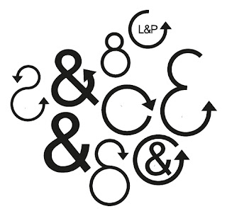
I tried out various options on Illustrator to test how it would look in a more professional and usable format and found that there were many ways to mix the two elements. I was a little disappointed with the traditional '&' shape, as I couldn't find many fonts where the end points were rounded enough to elongate into the circular recycling sign, but the effect is the same. On the whole it seems to be a concept that I can definitely use on my packaging, but I wanted to see how it would apply to the label.


The simple black ink on a rustic coloured background works well, and I feel would also look good against a more orange colour if required. I still wasn't sure about the adapted '&' shaped one, as it doesn't convey the effect I had hoped but the boldness gives it an eye-catching quality. I prefer the ampersand within the circular icon, both as a stand alone design piece and within the brand name 'Lea & Perrins'. It also brings the design up to date and appealing to today's style, including the serif 'the original & genuine'. I also created a piece for the back of the label to encourage reuse and recycling, and informing the user that the product is 100% recycled.


The labels look good on the bottle, and compliment the dark brown of the product, with clear or coloured glass. I used two different label styles, the first one piece of recycled paper wrapped around the centre of the bottle where the current Lea & Perrins label sits and one with a smaller label around the middle and a thin label around the neck of the bottle declaring the strapline 'the original & genuine'.


Interesting stuff Billy.. Like the rustic look.. I think there'll need to be some orange in there somewhere though.. Some nice early typo experimentation.. What about issues of 'value added' elements, bottle materials etc maybe?
ReplyDeleteAndy